The Problem Area //
1 in 3 Australians will require blood at some point in their life, and every week over 31,000 donors are needed around Australia to keep the supply up. However, only 1 in 30 people give blood every week.
With over 1,000 cancellations a week and 43% of first time donors who don’t return; it’s already hard to maintain blood supply.
Now with COVID-19 restrictions, less people are willing to donate regularly, causing a decline in blood supply.
The Solution //
By providing notification and infographic features that illustrate awareness and urgency, users are able to identify with the importance of fulfilling ongoing donations towards Lifeblood.
By designing a personalised goal system we were able to present the users with a more elaborate representation of how their donation is impacting lives. We feel that the added element of choosing how many times a user wants to donate a year reinforces motivation.
The Process //
Interviews //
33 Interviews: A mixture of regular, irregular and ineligible donors as well as nursing staff.
Data Synthesis and Analysis //
-Looking at the research from interviews and breaking it down to three persona groups: the model user, the impressionable user and, the apathetic user.
-Determining which persona represents the best potential for design opportunities.
-Defining pain & gain points and identifying a design goal through a problem statement.
-A design intervention will have a prominent impact on the app than the website since nursing staff are encouraging users to book/manage appointments through the Lifeblood App.
Problem Statement //
The 'impressionable user' needs to see the impact of becoming a regular donor so that they can routinely make contributions to Lifeblood.
'How Might We...' Design Speculations //
-How might we help Lifeblood communicate an urgency for donating blood in a more impactful way?
-How might we help users experience the impact of becoming a regular donor so they can routinely make contributions to Lifeblood?
Prototyping & Testing //
-Paper prototyping
-Digital Prototyping
-Usability Testing: 4 Iterations, 5 Users
We started the project with research by interviewing people in order identify the goals and issues users experience with the blood donation process.
Our research goals were to find out:
What motivates people to donate blood?
What’s preventing people from coming back?
Validate/Invalidate our client’s assumption that the COVID-19 news and restrictions have affected participation.
** An ineligible donor is someone who has regularly donated blood, but became unable (most commonly due to health reasons.)
Out of 33 interviews and 32 survey responses, we were able to establish certain characteristics
that differ between regular and irregular donors.
A 'Regular Donor' is . . .
Someone who maintains a consistent, scheduled donation of more than two times a year.
Often unprompted by callouts or advertising.
- Has a positive attitude towards donating blood and/or someone who has socially normalising it.
An 'Irregular Donor' is . . .
The next step was to deliberate between three main persona groups and establish a key persona. Who do we need to design for?
After synthesising our insights, we were able to determine these three archetypes:
The Model User; We like this user because they represent our goals and ideals.
The Impressionable User; is someone we consider to have the determination to be a more regular donor, but is hindered by a lack of information or prompts.
The Apathetic User; is someone who knows that donating blood is important, but would rather prioritise their time for work and leisure.
+ View Empathy MapOur persona should reflect that of an 'Impressionable User' because we will have a more rewarding impact with less of the effort. The 'model user' already represents our target user while the 'apathetic user' poses more risky obstacles such as a lack of motivation.
Meet Alex, our 'Impressionable User'
As someone who works in I.T. and has a digital mindset, we can assume that he is intrinsically motivated, and likes to be informed and aware of current issues (despite being a bit of a doom-scroller). He has donated blood before, but being in his 30’s and only donated 5 times, he displays characteristics of someone who hasn’t normalised donating blood yet.
Gains
- To know when his blood type is needed
- To know why or how his blood will save somebody
- To contribute more often.
"The world is full of distractions. I mean... there's a pandemic right now, the last thing that's been mentioned is taking blood"
Problem 01: Lack of Awareness about Blood Shortage
The average blood donor isn't sure whether their blood type is needed. Some people with a common blood type resort to a 'diffusion of responsibility' and excuse themselves from needing to donate.
We've also found that news coverage of
COVID-19 has eclipsed the news of blood shortages.
Therefore . . . How might we help Lifeblood communicate an urgency for donating blood in a more impactful way?

Illustrated by Janie Pham
Problem 02: Visual and Contextual Information
The average blood donor doesn't know how their donation is distributed. Who does it benefit? How much is needed in certain procedures and emergencies? This obscurity of information can create a feeling of indifference towards donating.
Therefore . . . How might we help users like Alex experience the impact of becoming a regular donor so they can routinely make contributions to Lifeblood?
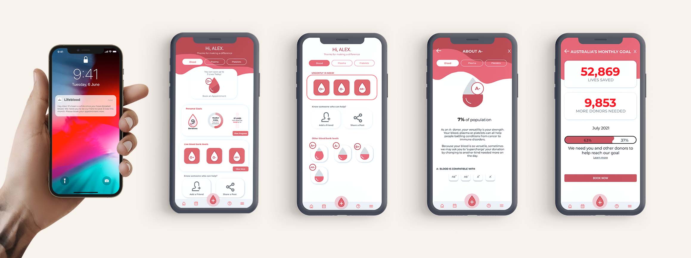
Flow 01: Notifications and Information
A push notification appears telling the user that it's time to donate blood again.
The user can then enter the homepage and schedule their next appointment. From the homepage they can also access their personal goals page, see the live blood levels, learn more about blood types, and check on how much blood Australians have donated this month.
We wanted to have this information accessible to users encourages them to donate. We also wanted to encourage users to share the blood shortage on social media, or invite their friends to book an appointment. During usability testing, one user was even surprised because he didn't know his blood type was compatible with other blood types.
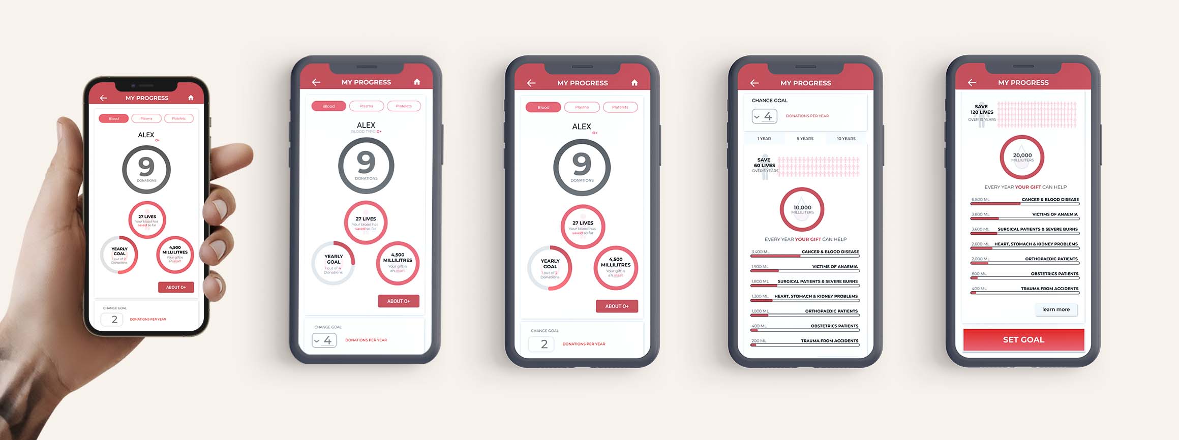
Flow 02: Setting Personal Goals
Users have the opportunity to set personal goals, and are given a more in-depth visual overview of how their blood donation is helping others.
By having the option to set the yearly goal from 1 to 4 times a year, the design prompts a dropdown that expands the information detailing where their blood donation is used. Helping in places such as surgery, cancer and obstetrics; users are given an estimate of how many millilitres, and also how many lives they're potentially saving. The dropdown also gives users an insight into their long-term goals, and how many lives one could save through consistently donating 5 or 10 years.
With this information we know that users will be less likely to feel indifferent about donating blood, knowing how and why they are saving lives.
Usability Testing: 4 Iterations - 5 Users
Through testing on five 'Alex-esque' users we were able to determine that:
- 5/5 Love being able to set goals and track progress.
- 4/5 Found the information to be straightforward and easy to understand.
- 3/5 Think that the blood shortage visualisation is very helpful.
- 3/5 Said they learned something new about donating blood
Outcome
Through this current iteration we're able to create a more positive user experience towards scheduling and fulfilling blood donations.
Our goal for Lifeblood is to encourage users to donate once or twice a year - thus motivating irregular donors into becoming regular donors and making sure the blood banks aren't critically low.
We also think this design intervention will reduce the costly need for staff to call people for donations, or for Lifeblood to spend less money on advertising and other costly call-to-action methods.
If you're keen to learn more about the process, check out my article on medium.com
Read case study


